STAgile is a quick and simple dashboard generator that gives the user the ability to create their own dashboards using Excel and CSV files including save, share, filter, export features...
What does STAgile offer?
- Simple design for intuitive operation
- You don't have to write a single line of code
- Generation of charts from Excel or CSV
- Navigate through hierarchies using drill down
- Synchronized Graphics
- Simple and user-friendly configuration system
- Export to CSV
- Table mode. View all your dashboard data
- Save and share your Dashboard
- Pentaho and web portals integration
STAgile is part of LinceBI Open Analytics solution
0. From Excel to Dashboards for end users
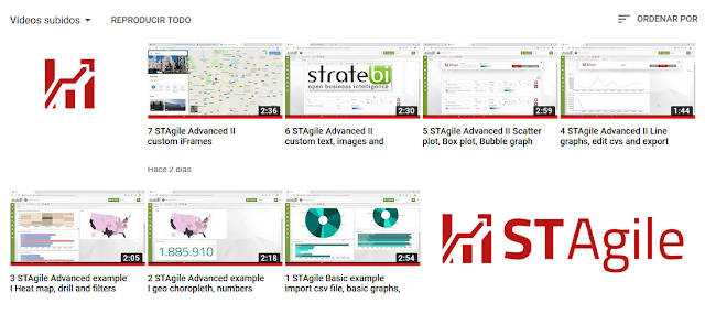
1. STAgile Basic example import csv file, basic graphs, dashboard view, export to csv
2. STAgile Advanced example I. geo choropleth, numbers graph
3. STAgile Advanced example I. Heat map, drill and filters with advanced graphs
4. STAgile Advanced I. Line graphs, edit cvs and export data
5. STAgile Advanced II. Scatter plot, Box plot, Bubble graph
6. STAgile Advanced III. custom text, images and links
7. STAgile Advanced IV. custom iFrames
Know more:
STDashboard (Web Dashboard Editor open source based), Video Tutorials
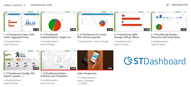
You can see on this series of VideoTutorials, the main features of STDashboard (best open source based web dashboarding tool, with no licenses and professional support included) and how it works STDashboard is part of LinceBI Open Analytics solution 0. STDashboard (Dashboard for end users in minutes) 1. STDashboard (LinceBI Open Source BI/BigData Solution) 2. STDashboard (LinceBI Vertical Dashboarding Solution) 3. STDashboard...
STPivot (Web Analytics open source based) complete Videotutorials
You can see on this series of VideoTutorials, the main features of STPivot (best open source based web analysis tool, with no licenses and professional support included) and how it works Besides, you can embed, customize and modify in order to fit your needs STPivot is part of LinceBI Open Analytics solution 1. LinceBI OLAP interactive analysis 2. STPivot OLAP Analytics for Big Data 3. Powerful Forecasts in STPivot 4. STPivot...
Introducing STMonitoring for Pentaho
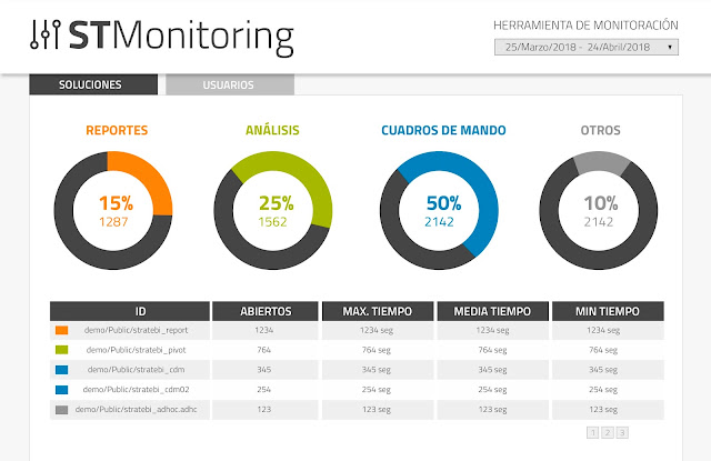
One of the things more useful when you are running a Pentaho production environment with a lot of users accessing the BI server, using reports, dashbords, olap analysis... is monitor the whole user performance. That´s why we´ve created STMonitoring (included free in all of the projects we help to develop and in some solutions, like LinceBI)....
STReport (Web Reporting Open Source based tool) Video Tutorials

You can see on this series of VideoTutorials, main features of STReport (best open source web reporting tool based, with no licenses and professional support included) and how it works STReport is part of LinceBI Open Analytics solution 1. STReport (creating simple report using rows, groups, filters) 2. STReport (Models, exploring categories and glossary) 3. STReport (Work area, hidden sections, limit results, info options...) 4. STReport...
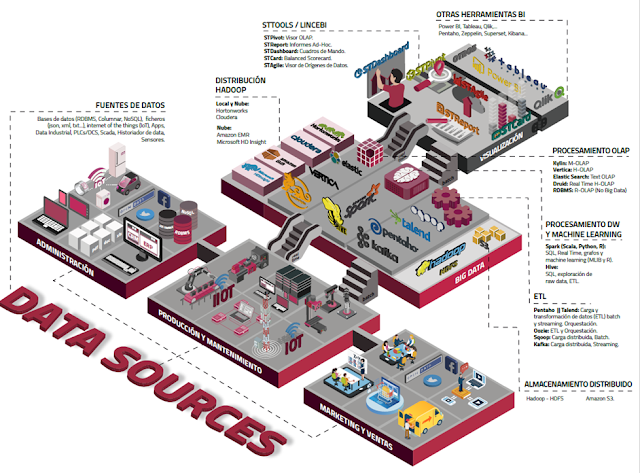
List of Open Source Business Intelligence tools

Here you can find an updated list of main business intelligence open source tools. If you know any other, don´t hesitate to write us - Talend, including ETL, Data quality and MDM. Versions OS y Enterprise - Pentaho, including Kettle, Mondrian, JFreeReport and Weka. Versions OS y Enterprise - BIRT, for reporting - Seal Report, for reporting - LinceBI, including Kettle, Mondrian, STDashboard, STCard and STPivot - Jasper Reports, including...
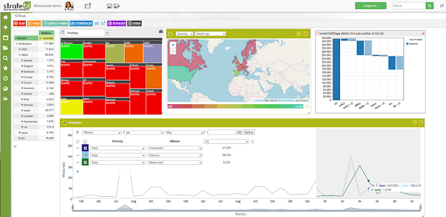
STDashboard, a free license way to create Dashboards
The improvements in this version of STDashboard are focused on user interface for panel and dashboard and also some enhancement in performance and close some old bugs. It works with Pentaho and embeded in web applications You can see it in action in this Pentaho Demo Online and as a part of LinceBI suite STDashboard doesn´t requiere anual license, you can manage unlimited users and it´s open source based. STDashboard includes professional...